On this project UX and UI were revisited for a better user experience and flow
ABOUT
Background
GroupHEALTH has grown to become one of the largest third-party group insurance administrators in Canada.
The final user usually goes to the app when they need either submit a claim or read about their coverage and check their policy number. Currently, the app has useful information, and the user can find everything they need there, however, there are a few issues with the flow which doesn’t make the information accessible and also, there are repetitions through the app.
Adding to that, the UI isn’t appealing and the colors are bland.
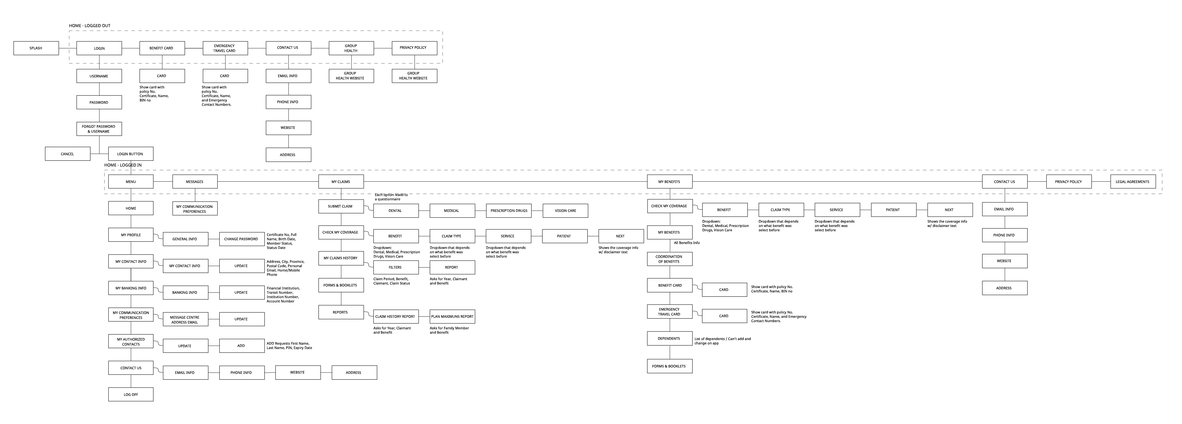
Current User Flow
Currently, the UX of GroupHEALTH follows a website structure, after logging in the user has a menu on the top left where is all the information, and after a few clicks, the user struggles to come back to the main page.
There are two Home Screens: one when the user logs in, where they see the same things from when they’re not logged in, with more info only.
There is Information repeated everywhere: Benefit Card, Emergency Travel Card, Contact Us, Privacy Policy, Check My Coverage, My Claims History has Report and there is a Report button outside too, and Forms & Booklets. Don’t need to repeat this information in order to be found, following an intuitive user flow will solve this issue.
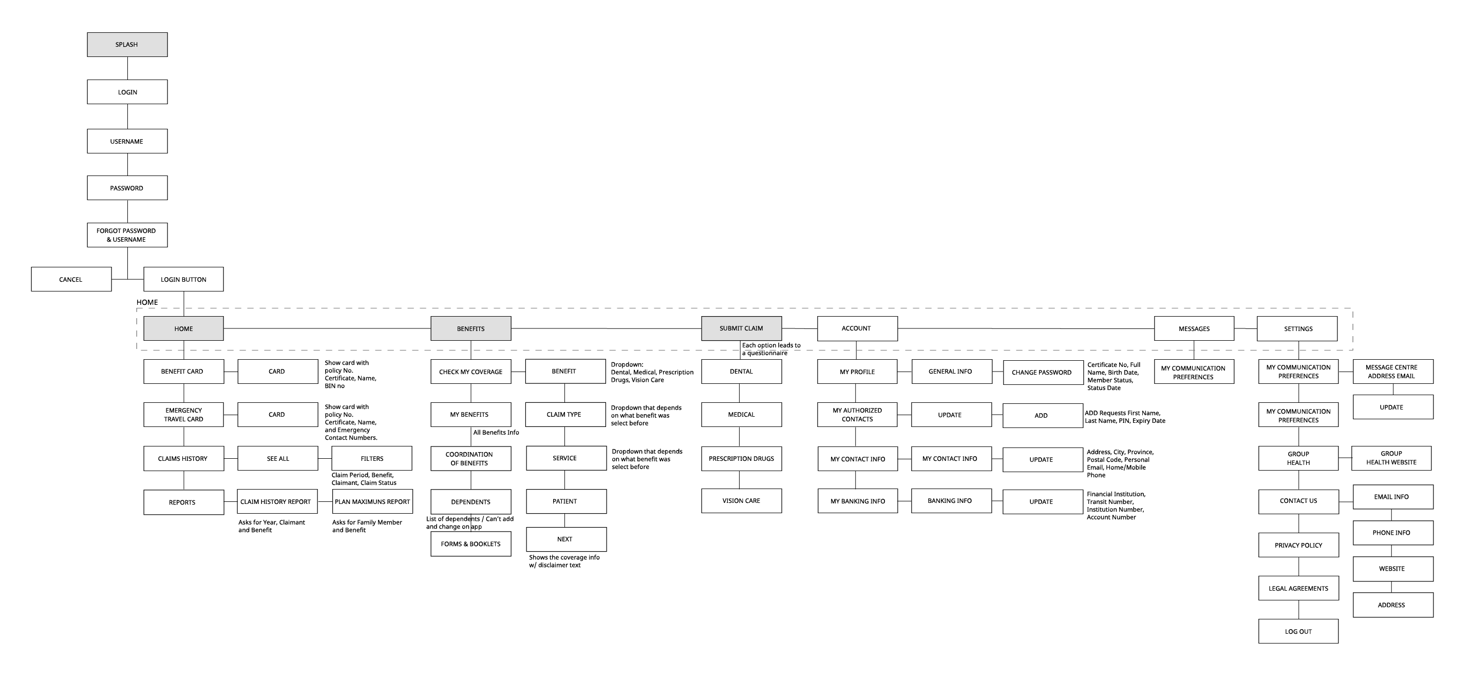
Proposed User Flow
The user doesn’t need to log in every single time the app is opened.
Because of this proposed change, there is no need for two main screens, and instead, only one Home focused on a user that is already logged in.
Emergency and Benefit Cards are on the home screen, and the user can find them first thing when they open the app. They need this information on their hands, especially when they are at the doctor’s and they need to provide a police number for a claim, for example.
Boxes with a Light Grey background were demonstrated below for the proposed UX and UI for GroupHEALTH.
UI Kit
GroupHEALTH is an insurance platform where the user has access to Claims, History of Claims, important information about coverage, benefits, policy information and etc.
Currently, the user interface is not friendly in fonts and colours and also follows a website structure.
GT Walsheim Pro was chosen because is a rounded, modern and friendly font, with three variations to give the freedom to apply on UI.
The current colour palette used is too bland and the light blue that is mainly used on the app pushes to gray, which combined with black and white, makes it hard to highlight important information and difficult to create a dynamic and intuitive app.
The new colours have red as a contrast with a more vibrant blue, together with a darker blue version. The secondary colours smooth the vibrance of red and blue and creates a harmonic combination.
The buttons use vibrant options to be highlighted on the app.
The bottom nav gives importance to Submit Claim, a relevant button that should be easy to find when the user is at the doctor’s or needs to submit information quickly and easily.
The alerts use the variation of red, to catch users’ attention to relevant information.
Icons were filled with red, creating a bold presence to highlight important information.
Examples of cards that are clickable shows the hover/pressed behaviour.
The app icon was refreshed with the new blue colour.
USER INTERFACE
Current & New UI
Notes
1 Currently, the user has to log in every time they open the app, and after a period of inactivity, the system logs out automatically. Because of that, the app has two home pages, one before login, and the other after login, which is shown side by side above.
2 This is the homepage after login, where the user can’t see their benefit card anymore, and they need to browse on the upper left menu. There is no bottom nav, which makes the navigation harder since it’s an app with various menus with relevant information on each.
3 After Login, the user will see this screen, always. They don’t need to log in every time, and inside SETTINGS (top right) they have the option to log out.
4 Claims History and Reports are part of the MY CLAIMS menu on the current app. With the proposed design, these options are added on the home page, since it’s relevant information together with SUBMIT CLAIM.
5 The bottom menu compiles all relevant information for the user, which is BENEFITS, SUBMIT CLAIM, ACCOUNT and MESSAGES.
Current
Wireframe
Proposed UI
Notes
1 In the current design, the user has duplicated information, as explained in the User flow. Benefit & Emergency card is shown on HOME, so they are not necessary on Benefits. MY BENEFITS it’s hidden on a button.
2 User benefits information is shown right after clicking on Benefits. This information is not the same as Benefit Card, shown on the HOME.
3 The dependents section shows the list of dependents, with the option to add a new one.
Current
Wireframe
Proposed UI
Notes
1 Currently, the SUBMIT CLAIM lacks an intuitive user interface.
2 The step-by-step process is intuitive, easy to follow and follows the new visual proposal.
Current
Wireframe
Proposed UI
Current
Wireframe
Proposed UI
Notes
1
In the current design, the user interface is not intuitive and follows a desktop website style.
Current
Wireframe
Proposed UI
Notes
1
In the current design, the user interface is not intuitive and follows a desktop website style.